Imagine this—you’re browsing a brand’s website on your phone, ready to buy something, but the page takes forever to load. Buttons are too tiny to tap, images overlap, and before you know it, you’ve closed the tab. Sounds familiar right? That’s exactly what poor mobile SEO looks like in action. In today’s mobile-first world, your Salesforce Commerce Cloud (SFCC) site isn’t just competing on design or product—it’s also competing on speed, structure, and mobile usability. Google knows this too, which is why mobile SEO directly affects your search rankings, traffic, and ultimately, your sales. Now here’s the thing: SFCC is a powerful eCommerce platform, but optimizing it for mobile SEO requires a different lens. It’s not just about adding a few meta tags or compressing images. You need to think about how SFCC’s backend structure, templates, and content delivery work together—because one bottleneck in that system can hurt the entire user experience. So, how do you actually make your SFCC site mobile-ready in Google’s eyes and your customer’s hands? That’s what this guide is here to solve—step by step, without the jargon. Let’s walk through what matters most, how to fix what’s broken, and how to future-proof your mobile SEO from here on.

Core Mobile SEO Principles (Applicable to All Sites)
Before you dive into platform-specific tweaks for SFCC, it’s crucial to get the basics right. Mobile SEO isn't just about code or tools—it's about how users actually experience your site.
So what should you focus on first? Think of it as a foundation: speed, design, content, and usability.
These principles apply universally, and once you’ve nailed them, you can build sharper SFCC strategies on top.
1. Responsive Design
Let’s start with something simple—your site should look good on any screen. Whether someone visits from a desktop, tablet, or phone, the layout needs to adjust automatically. That’s what responsive design does. It uses flexible grids and CSS rules that let your content flow naturally across different devices.
Here’s a quick visual to show how the same product page seamlessly adjusts across desktop, tablet, and mobile screens.
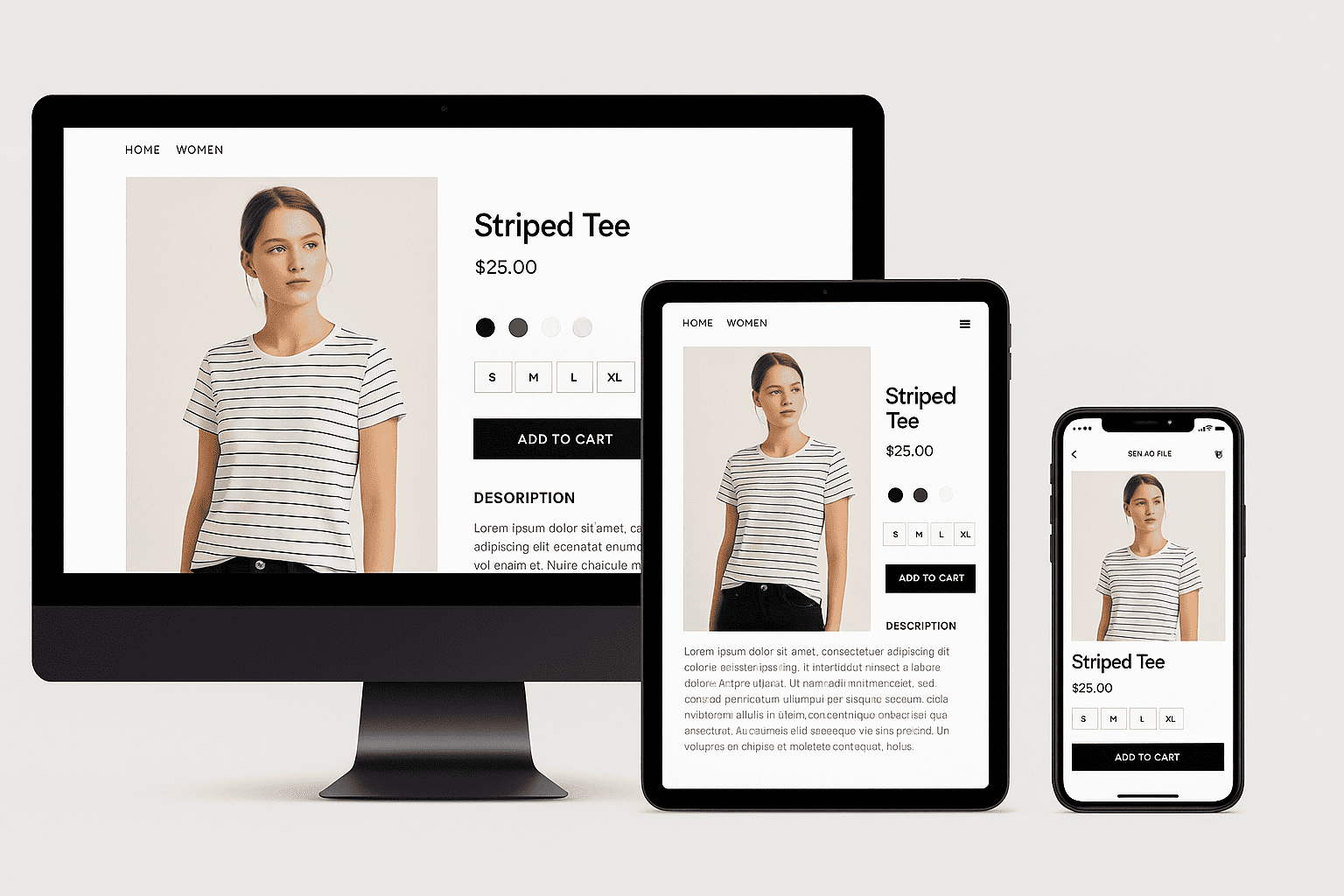
You don’t need multiple versions of your site for different screens. Instead, responsive design keeps one version that adapts. This is exactly what Google recommends, and it makes your life easier when it comes to SEO, maintenance, and future updates.
Here’s the key question: Is your content equally usable on a 6-inch phone as it is on a laptop?
If the answer is no—then users might bounce, and search engines will notice.
Now, don’t confuse this with just shrinking everything to fit. Responsive design is about rearranging elements so they still make sense. Headlines remain readable, buttons are tappable, and menus don’t become a puzzle to navigate.
It’s also important to check how things respond in real time. Use your browser’s device simulator or test on real phones. That way, you can spot issues like squished text, off-screen buttons, or broken layouts before your users do.
2. Mobile Page Speed
When it comes to mobile SEO, speed isn’t just a nice-to-have—it’s a dealbreaker. Think about it: you tap on a product link and the page takes forever to load.
What do you do? You bounce. That’s exactly what your users will do if your site is slow.
Google knows this too. That’s why mobile page speed is a direct ranking factor. But more than rankings, it’s about your user’s patience. You’ve got 2–3 seconds to make an impression—or lose a customer.
Take a look at the visual below—it breaks down the key elements that most commonly impact mobile page speed.
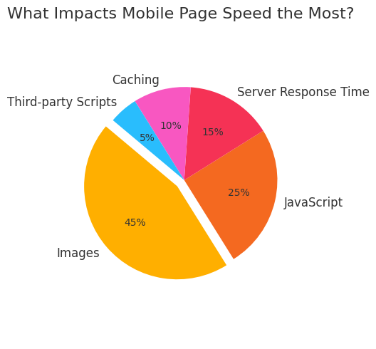
Now, how do you decide what’s slowing things down? Start with a speed test like Google PageSpeed Insights. Focus on mobile results, not desktop. You’ll get specific metrics like LCP (how fast the main content loads), FID (how fast your site reacts), and CLS (how stable the layout is).
The real fix begins with images. They're usually the biggest culprits. Compress them, serve modern formats like WebP, and use lazy loading for those lower down the page. Then, check your JavaScript. If it's bulky or loads all at once, it's killing your speed. Minify it, defer what’s not urgent, and remove what’s unnecessary.
Lastly, use browser caching and a good CDN. That way, repeat visits load lightning fast—and users actually stick around.
3. User Experience (UX) on Mobile
User experience on mobile isn’t just about how your site looks — it’s about how it feels when someone interacts with it. If your pages load fast but users struggle to read text, tap buttons, or find their way around, they’ll bounce — no matter how good your SEO is.
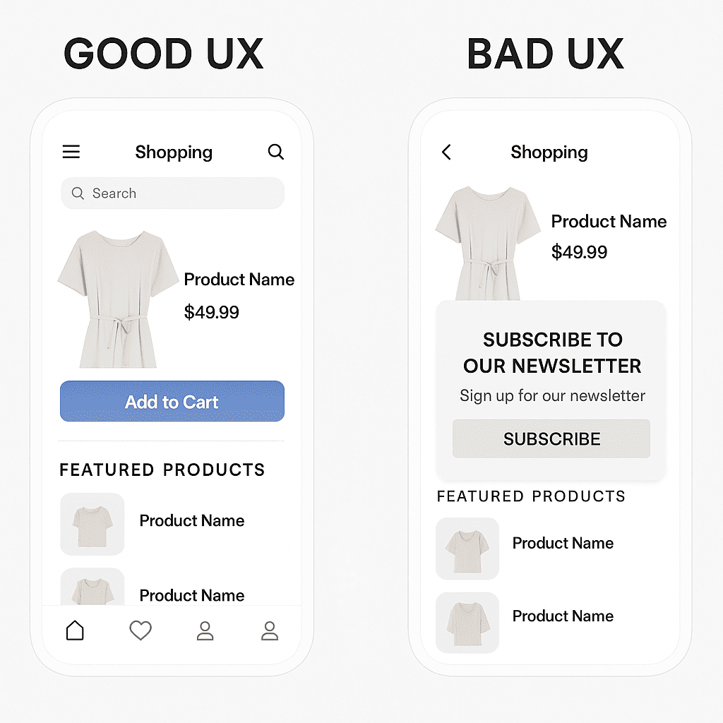
Take a look at the visual comparison below that clearly illustrates the difference between effective and poor mobile UX in an eCommerce layout.
So, what should you focus on?
Start by making everything readable and touchable. Your text should be large enough to read without zooming, and links or buttons shouldn’t feel like a game of darts. If users have to pinch or guess where to tap, something’s off.
Now think about navigation. A clean hamburger menu, a visible search icon, and a sticky header go a long way in helping people move through your site with ease. Don’t overload the screen. Keep things simple but useful.
Also, avoid annoying pop-ups that cover the screen. They frustrate users and even hurt your rankings. Instead, keep messages subtle and timed right.
Here’s what you should aim for:
- Minimum 16px font size
- Tap areas at least 48x48px
- No clutter or overlapping elements
Great UX helps users stay longer, engage more, and convert better — and that’s exactly what mobile SEO needs.
4. Mobile-Friendly Content
When someone visits your site on their phone, they’re not there to pinch and zoom. They're there to scroll, scan, and act—fast. That’s why your content should feel effortless on mobile. It should read naturally, look clean, and be built for thumbs, not just eyes.
So where do you begin?
Start with structure. Break long paragraphs into short, digestible chunks. Use clear subheadings, bullet points, and plenty of white space. This makes your content scannable, which is exactly what mobile users want.
Next comes readability. Use simple words, short sentences, and a tone that feels like you're talking to the reader—not presenting a report. Fonts should be at least 16px and contrast well with the background. If users squint or struggle to read, they’ll bounce—and Google notices that.
Now think about visuals. Don’t overload the screen. Use images and videos only when they add value. And always make sure they’re responsive, so they scale properly on every screen size.
Finally, test everything. Google's Mobile-Friendly Test is your go-to tool. It’ll flag what’s breaking the experience and help you fix it. Because in mobile SEO, content is king—but experience wears the crown.
Mobile SEO Audit for SFCC Sites
Before you start optimizing anything on your Salesforce Commerce Cloud (SFCC) site, you need to know where things stand. That’s where a mobile SEO audit comes in—it shows you what’s working, what’s broken, and what needs your attention first.
SFCC sites can get a little complex with their modular structure, so your audit has to be both strategic and specific. Start by thinking of the audit as your mobile performance health check. You’re essentially asking:
Is my site truly mobile-friendly in the eyes of both users and Google?
To answer that, you’ll need to run a few essential tools. Begin with Google’s Mobile-Friendly Test—it gives you a clear yes or no answer and highlights page-level issues like tap targets, font sizes, and viewport settings. Then move to PageSpeed Insights, switch to the mobile tab, and dig into the Core Web Vitals like LCP, FID, and CLS. These directly affect your mobile rankings.
Next, open Chrome DevTools, simulate a mobile device, and use the Lighthouse audit to get a detailed breakdown. Don’t forget to crawl the site using a mobile user-agent in tools like Screaming Frog to uncover any blocked resources or duplicate tags.
Here’s what you should look out for:
- Blocked JavaScript or CSS files in robots.txt
- Incorrect or missing <meta viewport> tag
- Pages that serve desktop versions on mobile
- Unoptimized images and oversized page elements
- Structured data missing on mobile pages
Finally, review your mobile sitemaps and canonical tags. SFCC can sometimes create discrepancies between mobile and desktop templates, so make sure they’re in sync.
By the end of this audit, you’ll have a full picture of what’s slowing your mobile site down—and a clear idea of where to begin fixing it.
SFCC-Specific Mobile SEO Optimization Strategies
So now that you understand how mobile SEO works in general, let’s talk about what makes SFCC different. You’re not just working with a regular CMS—you’re dealing with custom cartridges, ISML templates, and a modular architecture. That’s why your mobile strategy needs to fit the way SFCC builds and delivers content across devices.
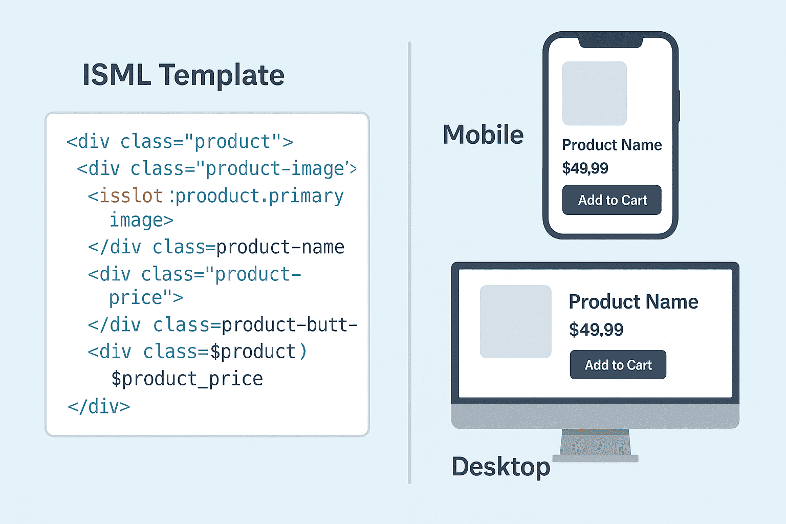
1. Leverage ISML Templates for Mobile-Responsive Layouts
Let’s start with the basics—ISML templates are what you use in Salesforce Commerce Cloud to build and render pages. They define how your content looks and behaves.
Now, if your site’s layout isn’t responsive, especially on mobile, then you’re basically shutting the door on a huge chunk of users. And let’s be honest, no one wants to pinch-zoom through a checkout.
Take a look at the visual below—it shows how an ISML template translates into responsive layouts on both mobile and desktop screens.
So, what’s your game plan?
You want your ISML files to be mobile-ready from the ground up. That means using a responsive layout structure. Go for CSS Flexbox or Grid instead of old-school tables or fixed widths. These modern CSS tools let your content adjust naturally based on screen size. One layout that adapts across all devices? That’s the dream—and it’s doable.
Also, use media queries smartly. Define clear breakpoints for mobile (like 768px or below). This lets you tweak padding, font sizes, or even hide/show elements just for mobile without duplicating code.
Here’s a simple decision rule:
If a user has to scroll sideways or zoom in, your layout is broken. Test every ISML-rendered page on real mobile devices, not just emulators. Especially PLPs and PDPs—they make or break conversions.
And finally, modularize your templates. Keep header, footer, and content blocks separate. This makes mobile-specific tweaks much easier without affecting the whole page structure.
Done right, this sets the stage for a seamless, responsive mobile experience—without any extra bloat.
2. Optimize Page Designer and Components for Mobile
When you're working with SFCC's Page Designer, it’s easy to think you’ve nailed the layout—until you see it on a mobile screen.
Suddenly, things that looked great on the desktop feel clunky, oversized, or just plain broken. That’s because not every Page Designer component is automatically optimized for mobile. You need to guide it.
The first thing to do is check how each component behaves on smaller screens. Are your banners scaling down correctly? Are the columns stacking neatly, or overlapping each other? If you're using grids, make sure they’re responsive—not fixed-width. Otherwise, your mobile users end up zooming, pinching, and bouncing off the site.
You also want to rethink how content is prioritized. Mobile users scroll more but have less patience. Push the most important content up—whether it’s product highlights, CTAs, or category filters.
Here’s what you should watch for:
- Use flexible containers instead of hardcoded heights
- Test all slots and modules in real mobile viewports
- Customize assets (images/text sizes) for mobile layout
If you’re using custom cartridges inside Page Designer, add mobile-specific CSS within the component so it adapts smoothly. And keep an eye on text—what reads fine on the desktop might turn into a wall of words on a phone.
The goal is simple: no resizing, no pinching, no confusion. Just clean, scrollable, tap-friendly content that feels effortless on mobile.
3. Minimize JavaScript & Render-Blocking Resources
If your SFCC site feels slow on mobile, JavaScript is often the reason. You see, most SFCC storefronts rely heavily on JavaScript—for carousels, filters, personalization, tracking, and whatnot. But the problem is, too much JavaScript delays how fast your content appears. And on mobile, users won’t wait.
Now think about how a browser loads a page. It goes top to bottom, and every time it hits a <script> tag, it pauses everything to load that script. This is what we call render-blocking. And if your mobile site is packed with these, users will see a blank screen for longer than they should. That’s not just bad for user experience—it’s bad for SEO too.
So what can you do?
Defer non-critical scripts—scripts that don’t need to load immediately. You can do this by adding the defer or async attribute. Push things like chat widgets, trackers, or newsletter pop-ups further down the load priority.
Also, SFCC’s cartridge structure allows you to modularize your JS. Use that to your advantage—load only what’s needed per page. Don’t dump your entire JavaScript library everywhere.
To help you plan better, here’s a quick breakdown:
Clean, intentional scripting helps your SFCC site feel fast—even on slower mobile networks.
4. Serve Optimized Images Using Dynamic Media
When someone lands on your site using a mobile device, what’s the first thing that slows them down? Almost always—images. That massive banner, your lifestyle shots, or even product thumbnails—if they’re not optimized, they eat up load time.
Take a look at the illustration below—it shows how a single product image adapts seamlessly across desktop, tablet, and mobile screens using Dynamic Media.

Now, SFCC gives you a solid weapon to fix that: Dynamic Media.
Dynamic Media is built right into the platform and lets you generate and serve images in real-time, based on the user’s screen size and resolution. Sounds technical, but here’s how you should think about it.
First, you want to make sure you're using responsive image tags, especially the srcset attribute. This way, your site doesn’t just serve one standard image size—it chooses from a set, and picks the best one for the user’s device.
Then, compress your images. With Dynamic Media, you can control quality using simple URL parameters. For instance, reducing quality to 85% (qlt=85) still keeps visuals sharp, but loads faster.
Also, modern browsers support WebP—so serve images in that format when possible. It’s lighter than JPEG or PNG, and your page loads snappier on mobile.
Finally, preload important images like your hero banner. It tells the browser, “Hey, this is crucial—load it first.”
That’s how you turn image bloat into blazing speed.
5. Improve Mobile Navigation and Interaction
When someone lands on your SFCC site from a mobile device, what's the first thing they do? They try to navigate. That’s why mobile navigation isn’t just a design choice—it’s a key SEO signal and a make-or-break moment for your user experience.
Start by thinking about your site’s structure.
On mobile, users don’t have the patience (or screen space) to deal with deep, cluttered menus. So, you need to simplify. Use a clean hamburger menu at the top and consider adding a sticky bottom nav bar for quick access to key sections like Home, Categories, Cart, and Account.
Now, zoom in on how people interact with your content. Filters and product sorters on PLPs shouldn’t be hidden or awkward to use. Instead of dropdowns, go for expandable accordions—they’re easier to tap and digest one section at a time.
The same logic applies to your mini cart and checkout experience: keep the flow linear, remove distractions, and make sure every button is large enough to tap without zooming.
Also, test how your mobile experience holds up with just one thumb. Are your buttons within thumb-reach? Can users navigate using just one hand? These small things build comfort, and comfort keeps people browsing.
At every step, your goal is clarity and speed. You want people to know exactly where to go next—without thinking too hard.
And when you nail that, you're not just improving UX—you're sending all the right signals to Google’s mobile-first index too.
6. Implement Mobile-Compatible Structured Data
Now, let’s talk about structured data—because if your SFCC site doesn’t speak Google’s language, you’re already behind.
Structured data helps search engines understand what your pages are about. Now, when you're optimizing for mobile, it’s not just about shrinking things to fit the screen—it’s about making sure Google sees the same content and markup on mobile that it sees on desktop.
So how do you do that?
Start by adding JSON-LD structured data directly in your ISML templates—this is the cleanest and most lightweight format. Use it to mark up important elements like Product details, your breadcrumb trail, and maybe even an FAQ if you're offering support content.
Why JSON-LD? Because it doesn’t mess with your layout, it keeps things fast, and Google actually recommends it.
Now here’s what matters:
Whatever structured data you add, make sure it appears on both desktop and mobile versions.
Google uses mobile-first indexing, so if something only exists on the desktop view, it might be ignored altogether.
Finally, test everything using Google’s Rich Results Test. That’s your sanity check before going live.
So in short—clean JSON-LD, consistent across views, and always tested. That’s how you make structured data work for mobile SEO on SFCC.
7. Test & Optimize for Mobile Core Web Vitals
Finally, something super important but often overlooked—Mobile Core Web Vitals. If your Salesforce Commerce Cloud (SFCC) site feels sluggish on phones, or users keep bouncing off, there’s a good chance these vitals are out of shape. Google uses them to judge mobile experience, so if you want better rankings and smoother shopping journeys, you need to fix them.
Now, what are these vitals, really?
There are three big ones to care about:
LCP (Largest Contentful Paint), FID (First Input Delay), and CLS (Cumulative Layout Shift).
Each of these tells Google something about how fast your site loads, how quickly it responds to touches, and how stable things feel as they load.
So where should you begin?
Start with Lighthouse (in Chrome DevTools). Run a mobile audit and note down which of these three areas you're failing. Once you know, here's how to fix them:
- LCP: This is often your banner image or product grid. Preload the most important images, and make sure your server/CDN is delivering them fast—especially on mobile networks.
- FID: Big delay after tapping a button? That’s FID. Minimize JavaScript. Don’t overload pages with trackers and 3rd-party tools.
- CLS: Hate it when buttons shift while you’re about to tap them? That's a layout shift. Avoid it by reserving space for banners, carousels, and product tiles—no surprises.
With SFCC, you’ll usually be working inside ISML templates and Page Designer. So make sure mobile layouts are tested often. Set static dimensions in your image containers and avoid injecting components without space planning.
Keep these three metrics in check and your site won’t just perform better—it’ll feel faster, cleaner, and more reliable to every mobile shopper who visits.
And that’s exactly what Google wants to see.
Technical SEO Considerations for Mobile in SFCC
So now that you understand the mobile design and content basics, let’s talk about the behind-the-scenes stuff—yes, the technical side of SEO that actually decides how well your SFCC site performs on search engines.
You might be wondering, why focus on this? Because even a perfectly designed mobile page won’t rank if search engines can’t crawl, index, or interpret it correctly.
Let’s break down the technical must-dos that ensure your mobile site isn’t just pretty, but powerful too.
1. Dynamic Serving vs. Responsive Design
When it comes to mobile SEO, one big decision you need to make is how your site delivers content to mobile users. Responsive design and dynamic serving are two very different approaches.
In responsive design, you serve the same HTML code and URL to everyone, and CSS adapts how things look depending on screen size. Simple, right? Google loves this—it’s easy to crawl, index, and maintain. Most SFCC sites prefer this because it's scalable and less error-prone.
Dynamic serving, on the other hand, sends different HTML to users based on their device. Your server detects whether the visitor is on a phone or desktop and then serves a tailored version of the page. It can feel more customized, but there’s a catch: you must send the correct HTTP header — Vary: User-Agent. Without it, Google might get confused and index the wrong version.
Here’s how they compare:
So, unless you need drastically different layouts, stick with responsive. It saves time, avoids SEO headaches, and just works.
2. Canonicalization and Hreflang Tags
When your SFCC site has similar content across mobile and desktop—or across countries—you need a way to tell Google which version to treat as the main one. That’s where canonical and hreflang tags step in. They help search engines avoid confusion, prevent duplicate content issues, and show users the right version of your page.
Start by using canonical tags to signal the primary version of a URL. For SFCC, this is often your standard desktop URL—even if mobile users see the same content responsively. Just make sure each version, including mobile, references itself correctly with a <link rel="canonical">.
Now, if you're targeting users in multiple regions or languages, hreflang tags are a must. They guide Google to serve the right version of your site based on user location or browser language.
Always ensure hreflang tags are reciprocal and match the canonical URL on each page. In SFCC, these are best implemented dynamically using ISML templates or through controller logic.
3. Mobile Sitemap Best Practices
Sitemaps sounds technical, but it’s really just about making sure Google can see and understand all your important mobile content.
So here’s the deal: if your site uses responsive design (which it probably does), you don’t need a separate mobile sitemap. Just make sure your regular sitemap includes all the main URLs. But if you’re using separate mobile URLs (like m.example.com/product.html), then you must tell search engines these are mobile versions.
How? With this simple XML addition inside your sitemap:

This <mobile:mobile/> tag tells Google, “Hey, this is a mobile page, index it accordingly.”
In SFCC, you can automate this using scheduled jobs that fetch URLs from your catalog and insert the right mobile tags. The goal is simple—whatever mobile content you want Google to index, list it cleanly and clearly in the sitemap.
No fluff. Just clean URLs, right tags, and regular updates. That’s it.
4. Pagination & Infinite Scroll Handling
When it comes to mobile SEO on your SFCC site, how you handle pagination really matters.
Think about your product listing pages—users often scroll endlessly, and you might’ve added an infinite scroll or “Load More” feature to keep them engaged. That’s great for UX, but if Googlebot can’t access those deeper product items, they may never show up in search results.
Here’s where you need to be smart. Infinite scrolls powered purely by JavaScript can hide content from crawlers. So, if you’ve used it, make sure there's a crawlable fallback. One simple approach is to include a “Load More” button that loads new content via real links or dynamically updates the URL with parameters—something a bot can follow.
Traditional pagination still works too. You can use numbered pages with clear URLs (like /page=2, /page=3). While rel="next" and rel="prev" are no longer required by Google, keeping your pagination logical helps all bots navigate better.
So, pick a method that suits your design, but always keep it SEO-friendly and crawlable.
5. Robots.txt and JavaScript/CSS Rendering
When Google crawls your SFCC site, it doesn’t just read the HTML—it also tries to render the page like a real browser would. That means it needs access to your CSS and JavaScript files. If your robots.txt is blocking folders like /on/demandware.static/, Google might not be able to see how your page really looks or functions—especially on mobile.
This can mess up your layout in search previews or cause Google to misjudge how mobile-friendly your site is.
Not ideal, right?
The fix is simple:
Open your robots.txt file and check if you’re disallowing static resources.
If you see lines like Disallow: /on/demandware.static/, that’s a red flag. Remove or adjust those rules to allow Googlebot full access to essential CSS and JS.
Always test your pages using Google’s Mobile-Friendly Test or PageSpeed Insights. If rendering fails or looks broken, your blocked resources might be the culprit.
Ready to Make Your SFCC Site Mobile-SEO Friendly? Here’s Your Next Step
So, where do you go from here? If you're working with an SFCC site, optimizing for mobile isn’t optional—it’s foundational. Think of it like tuning your engine before a race. Without responsive design, quick load times, and mobile-focused SEO tags, you're just not in the competition.
Start by auditing what you already have. Check your layouts, your load speeds, and whether your structured data works well on phones. Then, work through improvements, one step at a time.
And if you want a serious edge? Use Seorce.com—The SEO Platform Built for Scale, Speed & Precision. It tracks rankings, analyzes backlinks, creates content, and fixes SEO issues—all powered by AI. With the right tools and some thoughtful changes, you’ll be mobile-ready in no time.
FAQs
1. Why is mobile SEO different for Salesforce Commerce Cloud (SFCC) sites?
Mobile SEO is different in SFCC because of its custom code structure using ISML templates and controller logic. Developers must ensure mobile-friendly elements, fast loading, and responsive design are properly integrated without breaking SFCC’s backend or business logic.
2. Can I use Page Designer for mobile SEO in SFCC?
Yes, Page Designer lets you create mobile-friendly layouts by dragging and dropping modules. You must still test how each module looks and loads on mobile. Also, check if the mobile version loads fast and adjusts properly across different screen sizes.
3. What is the biggest mobile SEO mistake on SFCC sites?
A common mistake is not optimizing images for mobile, which slows down the page. SFCC supports dynamic media, so use compressed images and srcset tags. This helps speed up loading and improve rankings on mobile search results.
4. How does Google crawl mobile pages on SFCC?
Google uses mobile-first indexing, so it checks how your SFCC site performs on mobile first. If mobile pages are slow or have layout issues, your ranking drops. Always test your mobile site with Google tools like PageSpeed Insights or Search Console.
5. Do mobile and desktop pages need separate SEO setup in SFCC?
No, they usually share the same SEO setup if responsive design is used. But always make sure meta tags, structured data, and content are equally visible on both. If you're using dynamic serving, use proper headers and canonical tags to avoid SEO loss.

Kulraj Singh Sabharwal
A digital marketing expert specializing in content writing, journalism and advertising copywriting.
Get Started Today
See how our AI-driven platform can transform your SEO strategy. Get real-time SEO metrics of any website or URL.

Get the week's top marketing content delivered to your inbox.
Explore Similar Blog Posts
Find more valuable content to inspire your next move in marketing or SEO.
Content Gap Analysis: Using AI to Find Hidden Opportunities
 Kulraj Sabharwal
Automated Quality Assurance for SEO Changes
Kulraj SabharwalAI-Powered Keyword Research: Beyond Search Volume
Kulraj Sabharwal
 Start Free Trial
 Request a Demo